Monday 27 February 2017

Unit X

Initial Drawings. 

  • Mark making.
  • Using a colour scheme and inspiration for my primary photos.
  • Using a a selection of pallet knifes in broad range of sizes to build up layers of paint.
  • Painting on top of white paper and colour materials, using light and dark denims and an orange waterproof fabric, still within my colour scheme to work on different textures. 
  • Mixing the layers of paint to create different strokes that blend together. 


Wednesday 22 February 2017

UNIT X

Lynn Sanders


  • Looking at the texture and layering of paint that has been built up.
  • How the paint has been spread using a pallet knife, all directions been vertical making you look up and down the design.
  • Different thicknesses of marks been used. 
  • Opaque and transparent layers creating different textures and ranges of colour. 


Monday 20 February 2017

UNIT X

P.E Nation 

  • Context reference.
  • Contemporary garments designs, swimwear and sportswear. 
  • Quality products and materials. 
  • Simple and minimalist designs.
  • Primary colours. 


Friday 3 February 2017

Evaluation.


For both my self initiated projects I started with two completely different themes, for my first project I was looking at LED, neon lights and signs to inspire my prints for a womenswear collection. For my second project I took inspiration from texture I found at the coast, to create print for a bags and accessories.
Overall I feel I could have more work for each of the projects I have done this unit but I feel that the work I have created is to a good standard and each out come is completely different showing a diverse range of designs.

First self initiated project I think I had a good source of images and research to work with, I think I developed these well resulting in a range of individual bold prints that related back to my original images.
I think I could of developed these further through screen printing or making more digital, graphic prints. As well I feel I could of worked on range of other materials that would make my prints more intense but I liked how the organza material I used gives off a shine and slightly distorts the design, fading in and out of colour.
My designs on the body work well when put into context, making them more realistic which makes them more believable as a print. I think creating a look book to present my images in is the best possible outcome to show my ideas and designs.

For my second self initiated project I feel my final prints in context work well and have been presented professionally. I think the overall idea and theme of my designs is strong, but I could improve this project buy have a wider range of final prints. From this second project I have learnt that my initial drawings should be much broader as I stuck with the same mark making media to create my drawings when developing them they all looked very similar and for a collection of prints I need to have a wider range of designs. I also struggled to identify my colour scheme which effected my prints through out, in the end completely changing my colour scheme was most beneficial after seeing my prints in context they where more successful after changing the colours.  

For the Bradford Textiles Society Design Competition, I feel my ideas could have been developed further through screen printing but for a quick brief that was for a mens t-shirt collection I think the designs and prints I have produced have worked well and come out with some appropriate and fitting designs that digitally printed still present texture and mark making.

Overall I feel more confident working digitally with designs then adding in elements of screen and mono printing, stitch and laser cutting to a print and I feel this suits me and my way of working best. Additionally, I prefer working digitally putting my work into context, photoshopping my prints onto the body and seeing my designs on a garment or bag making them more realistic. As well as creating a look book playing around with presentation to display your prints, design and theme.


Saturday 28 January 2017

LIVE BRIEF - Bradford Textiles Competition

Boris Peianov.

  • Cutting the design into geometric shapes.
  • Working over the top of a photo to create a collage.
  • Over layering and moving the design so it inaccurate and fits differently together.
  • A mixture of photography, blank shapes and lines build up the design. 
  • I am looking at how Peianov has layered his designs with simple white shapes that overlay as garments. I feel this design could work over my own photographs covering sections of the design. 


LIVE BRIEF - Bradford Textiles Competition

Custommade fragrance campaign.


  • Build up of paint, mixing a range of colours and layers.
  • Texture and mark making brush strokes.
  • Combining photography and painting media, drawing.
  • Simple minimalistic technique covering an image, adding to the design giving the photograph a different element.  


Wednesday 25 January 2017

LIVE BRIEF - Bradford Textiles Competition

Context.


  • Putting my prints into context to see how they work on a mans t-shirt.
  • Playing around with placement and enlarging the scale on the body.
  • Having all over prints that cover the t-shirt as well as looking at placement prints, covering sections of the top. 
  • Keeping minimal with black and white prints with small amount of blue added in some prints. 


Friday 20 January 2017

LIVE BRIEF - Bradford Textiles Competition

Final Designs.

  • Selecting my final prints by looking at which are the most effective in context.
  • Images that had texture on top of them I felt have worked the best and most effective. 
  • Creating prints for menswear I have to think what designs will be suitable for my target market and if they will wear these designs. 
  • Using prints that have white marks extracting image I feel are more appropriate as they are not as busy and full for an all over printed t-shirt design. 


Wednesday 18 January 2017

LIVE BRIEF - Bradford Textiles Competition

Mono Printing.

  • After heat transferring my images onto polyester jersey, I mono printed again over the top of some of my samples to add to the design. 
  • Using thick paint brushes to create wide brush strokes to print.
  • Using salt to soak up some dye and add texture to the print instead of it been a flat mark. 


Monday 16 January 2017

LIVE BRIEF - Bradford Textiles Competition

Photoshop Development.

  • Creating prints for Menswear t-shirts and tops. 
  • Developing my photographs and mark making together through Photoshop. 
  • Removing colour and adding colour from my photos through a range of marks. 
  • Working with black and white, adding in an accent colour of blue.
  • Editing transparency, layering and combing my images together. 
  • Layering marks so they look realistic and still have texture on top of the photographs. 


Tuesday 10 January 2017

LIVE BRIEF - Bradford Textiles Competition

Mark Making.


  • Changing my primary imaging into black and white and responding the them through mark making to create my initial drawings.
  • Using a range of card and cut card, pallet knifes and paint brushes with thick black paint to create rough marks.
  • Printing my images off and working over the top of them creating marks that follow the images. 


LIVE BRIEF- Bradford Textiles Competition

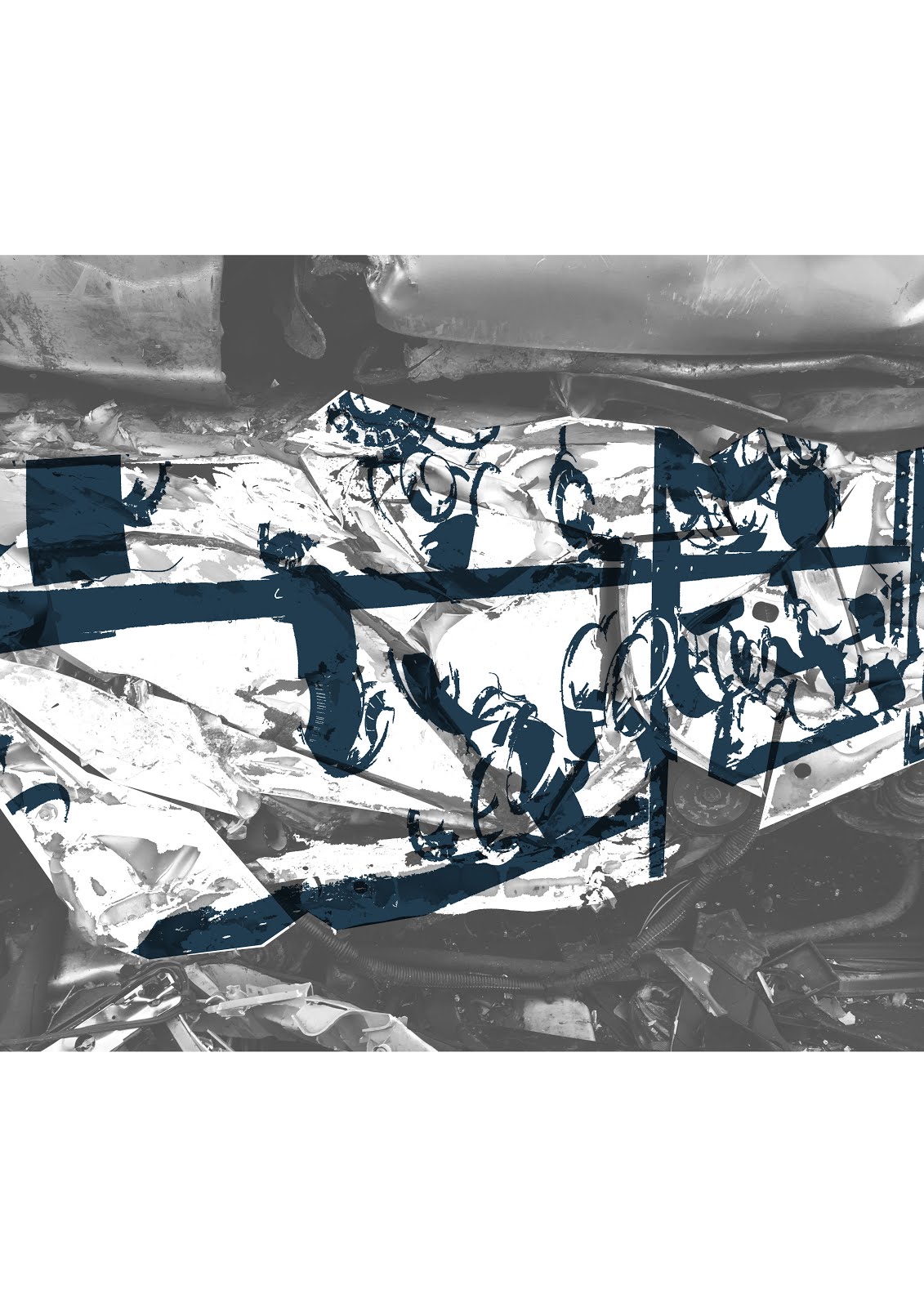
Context and Target Market.


  • Creating my designs for a target market of young men.
  • Ranging in age from 18-30, aiming for a high street market.
  • Designing graphic t-shirts using my primary photos, that create a masculine print.
  • Looking at all over prints and placement patterns. Creating panels with in my designs.
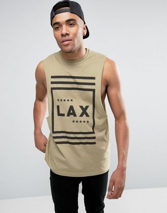


Urban Outfitters.


  • Looking at Urban Outfitters
  • Graphic printed t-shirts, black and white colour schemes. 
  • All over the body, placement print in sections and across the body text. 
  • Abstracting colour and text in an all over texture print. 
  • Panels of print on the body and arms.


The Sting.


  • All over, repeat pattern prints. 
  • Subtle colours scheme, suitable for target market. 
  • Block print, black stripes over print to mute design down. 
  • Black pocket details on all over prints.


Asos.


  • Texture and mark making prints. 
  • Graphic designs and text.
  • Placement prints and colour covering different sections of t-shirts.
  • Minimal designs.


Origin68.


  • Looking at the size of the use of placement print on these t-shirts.
  • Repeated use of a rectangle area that is used for a print. Placement prints.
  • Simple white t-shirts with a single coloured screen print designs.