Moschino Fall 2015.
- Bold print of spray paint covering garments.
- Different thickness of print layering over each other to build up a full print.
- Looking at scale of prints and design on the body.
- Also looking at the expression of the graffiti print using solid colour, spray paint.
Berta Fischer.
- Photographed well to show the light and reflection.
- Created a mixture of tones and shades of colours.
- Bold colours.
- Neon light effect from sculpture.
CBA.
- Looking at how CBA uses pink within his work, from luminous to baby pink he uses a whole range of pinks within his colour pallet.
- The range of media used within his collages as well as the range of media and mark making techniques that are used.
- Different scales are used, from thick paint strokes and markers to pencil lines.
- Layering marks, using more transparent medias over the top to show design underneath.
- Bold black marks to define drawings, creating a focal point.
Lookbook.
- After taking photos to put my work on the body in context, I decided to display these within a look book to present my final designs.
- After creating a layout for my look book I have produced a minimalistic and clean design with in my book to focus on my selected images. Using a range of my primary photos, inspiration, final prints and context images to build up a theme of design.
- I think this is a good way to present my final designs, having it professional printed so my images are good quality and clean.
Context.
- After researching more into my context and target market I found that my prints where more effective and impressive when printed on silk organza, rather than on stretch jerseys and lycra's.
- After changing my materials I have also changed the attire of my target market.
- Seeing my designs work on organza and satin materials for women's party wear. Spring/Summer 17
- Digitally importing my designs onto fabrics to see my prints in context.
- Looking at how they would work on the body and working with different scales of my prints.
- I think this has worked well to see how I envision my prints on the body in context.
First Context Ideas.
- Thinking about my prints in context, looking at sportswear garments using flats to look at how my designs would work on the body in context.
- Womenswear Spring/Summer 17
- A mix between sports wear and casual attire.
- Looking at using my designs on materials such as mesh, cotton, lycra and jerseys.
- Looking at the scale of the design on the body and the amount of print been used.
Final Designs.
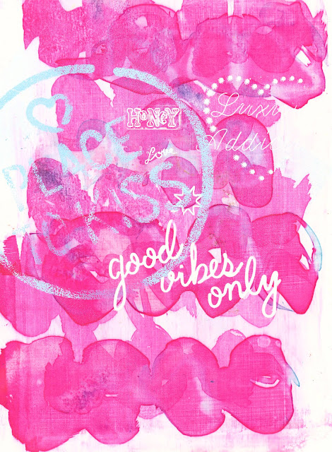
- My final designs are a mixture of my drawings layered with edited photos of neon light outlines. With words and shapes layered within the design, keeping with my original photographs of slightly raunchy slogans and signs.
- Using bright bold background colours of pinks, purples and blues to stand out, but have a range of final designs where some are slightly more subtle that others.
- Processes of mono printing and photoshop have been used to develop these digital prints.
- I think the text works well in these designs as it adds a different element to the drawings and mark making of the designs.
- I need to think about scale of these deigns on the body and where they would work. I see them as placement deigns rather than repeated, all over patterns.
- I think to develop my designs further I could add foiling to the prints so they have a reflective element and shine to give an impression of reflection and light bouncing off the print to link back to my starting point of looking at neon lights and signs.